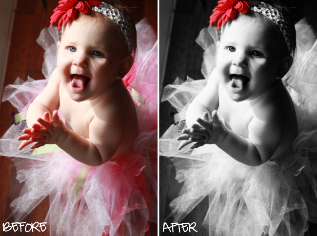
I like how b/w makes shadows looks less..."shadowy", if you will, and more..."blendy" (to use another technical term). This one is nice, although I forgot one minor thing that I did on the second and third edits...can you guess what it is? :)

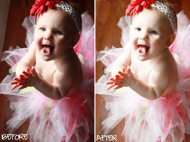
Now, because of the shadows, I had a really hard time brightening up the photo without washing out this little cutie. Not sure I accomplished what I really wanted to...but, it's definitely less shadowy.

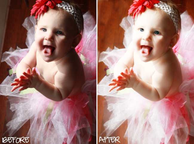
This one is a teeny-tiny bit different...more contrast in color...

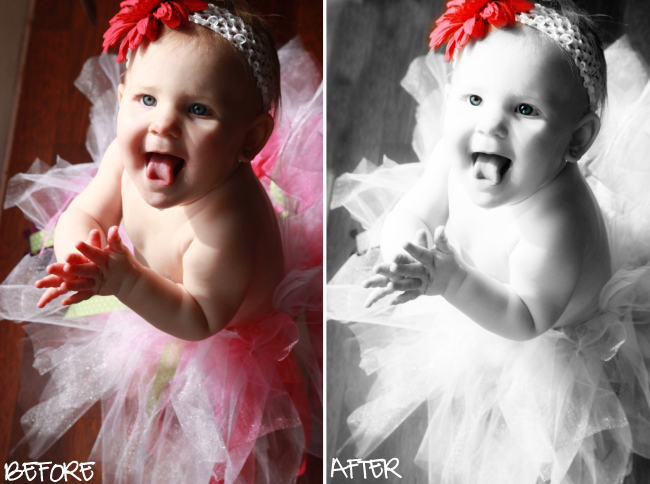
And here's a little BW action AFTER I "brightened" the photo a bit. I'm liking this "whimsical" feel!


5 comments:
All of your edits are great! I don't know that I could pick a favorite..
You did such a great job with the selective color! I love selective color but have yet to master that skill (I blame it on my dying PSE 4 :oP lol)
Thanks for the comment! :o)
The bit of floor showing? ;) Great job! I love little girls in tutus! =D
I have a suggestion for a "Fix-It Friday". Submit a picture here and then we all get a chance "fix it" and send it back. It would be fun to see how different people would handle it differently. Perhaps people could give a brief explanation of what tools and processes they used to fix it.
Adorable! I have know idea what your forgot to do!
Hi,
Its the first time I visit your blog, but this is always what I waould like to know: How do you capture a red flower in a b/w photo? , Thats what I like , besides the great face of the baby, just made on the right moment. My compliments.:)
JoAnn's-D-Eyes/Photography /Holland
Post a Comment